Scenes of Canada
Scenes of Canada was the fourth series of banknotes of the Canadian dollar issued by the Bank of Canada. It was first circulated in 1970 to succeed the 1954 Series, and was replaced by the Birds of Canada series beginning in 1986.
Design
The design process for this series began in 1963 with a primary goal of creating banknotes that were more counterfeit-resistant than the 1954 Series it was to replace.[1] The Bank of Canada requested design submissions from security printing companies, receiving several from both domestic and foreign companies.[2] One proposed design was received from Organisation Giori, a Swiss security printer based in Lausanne that had developed a multicolour printing press "that raised the bar on banknote security".[2] Its designs for the $10 and $20 banknotes were a "significant departure" from traditional Canadian banknote designs by incorporating more colours, new graphic elements, and different security features, but the design was rejected.[2] Final conceptual designs were created by Canadian Bank Note Company, British American Bank Note Company, and De La Rue, the latter being the first foreign firm involved in the design of Canadian banknotes.[1] The design by De La Rue was selected by the Bank of Canada in 1964 as the basis for the new series.[1]
Each denomination retained the dominant colour of the respective banknote from the 1954 Series: green for the $1 banknote, orange (terracotta) for the $2 banknote, blue for the $5 banknote, mauve (purple) for the $10 banknote, burnt orange (red) for the $50 banknote, and brown for the $100 banknote.[3][4] Because of the multicoloured tints used to complement the design for each banknote, Bank of Canada staff began referring to the series as the "multicoloured series".[1]
The portraits on the obverse of each denomination were larger than for the same denomination in the 1954 Series.[4] Initially, all denominations were to feature the portrait of Elizabeth II, but portraits of former prime ministers were used for some denominations at the request of Edgar Benson, the Minister of Finance in 1968, to "reflect Canada's burgeoning national identity".[5] The vertical borders of the obverse were curvilinear, the left edge of which had "multicoloured diamonds" bordering a circular frame within which was the Coat of Arms.[6] It also featured "sweeping guilloché" patterns.[6]
The reverse of each denomination had a scenic vignette.[7] The initial design by De La Rue included a circular watermark that was excluded from the final design.[6] A memorandum circulated to designers during the design process stated that the "subjects chosen represent a substantial improvement in range of contrast and detail", to improve security.[8]
The phrase "will pay to the bearer on demand" that appeared in earlier banknote series was replaced by the phrase "this note is legal tender".[9]
Security
Colourful, wavy patterns were part of each denomination's design.[1] The serial numbers on the obverse were printed in red on the left and blue on the right.[10]
In addition, this is the first series that has interleaving position of English and French text. The interleaving nature is by text on the same side, as well as by denomination. The following table is a complete representation of all positions of English texts on all denominations.
| $1 | $2 | $5 | $10 | $20 | $50 | $100 | |
|---|---|---|---|---|---|---|---|
| "Bank of Canada" on obverse | L | R | L | R | L | R | L |
| Value on obverse | R | L | R | L | R | L | R |
| "This note is legal tender" | L | R | R | L | L | L | R |
| "Deputy governor" | R | R | R | L | L | R | L |
| "Governor" | L | R | R | L | L | R | L |
| Value on reverse | L | R | L | R | L | R | L |
| "Bank of Canada" on reverse | R | L | R | L | L | L | R |
Banknotes
The dates stamped on the banknotes represent the year in which the original intaglio plates were produced for that denomination.[10] The most prominent designer for this series was C. Gordon Yorke, who engraved the portraits of Robert Borden and Wilfrid Laurier and the vignettes for four of the seven denominations.[11]
All notes measure 152.4 × 69.85 mm (6 × 2¾ inches).
| Value | Main colour | Obverse | Reverse | Series Year | Issued | Withdrawn |
|---|---|---|---|---|---|---|
| $1 | Green and black | Elizabeth II | The parliament buildings from the Ottawa River, Ontario | 1973 | 3 June 1974 | 30 June 1989 |
| $2 | Terra cotta | Elizabeth II | Inuit hunting on Baffin Island, Northwest Territories | 1974 | 5 August 1975 | 2 September 1986 |
| $5 | Blue | Sir Wilfrid Laurier | Salmon seiner BCP 45 in Johnstone Strait, British Columbia | 1972 | 4 December 1972 | 1 October 1979 |
| $5 | 1979 | 1 October 1979 | 28 April 1986 | |||
| $10 | Purple | Sir John A. Macdonald | Synthetic rubber plant (Polymer Corporation) in Sarnia, Ontario | 1971 | 8 November 1971 | 27 June 1989 |
| $20 | Green | Elizabeth II | Moraine Lake and the Rocky Mountains, Alberta | 1969 | 22 June 1970 | 18 December 1978 |
| $20 | 1979 | 18 December 1978 | 29 June 1993 | |||
| $50 | Red | William Lyon Mackenzie King | The RCMP Musical Ride | 1975 | 31 March 1975 | 1 December 1989 |
| $100 | Brown | Sir Robert Borden | Lunenburg Harbour, Nova Scotia | 1975 | 31 May 1976 | 3 December 1990 |
$1 note
The original design for the $1 banknote used green as the dominant colour, but final designs used black to mitigate possible confusion with the $20 banknote.[6]
The portrait on the obverse is of Elizabeth II,[4] the engraving for which was created by George Gunderson, master engraver at British American Bank Note Company.[12] A tugboat is prominent in the foreground of the vignette on the reverse, which depicts the Ottawa River with a broken log boom with Parliament Hill in the background.[13] It was engraved by Yorke based on a 1963 photograph taken by Malak Karsh.[13]
The banknote was first circulated in June 1974, and was printed by both CBN and BABN.[13]
$2 note
The portrait on the obverse is of Elizabeth II.[4]
The reverse of the $2 banknote features a scene of six men of an Inuit family preparing their kayaks for a hunt, based on a 1950s photograph of Joseph Idlout and his relatives taken at Pond Inlet in Baffin Island by Douglas Wilkinson.[14] It was engraved by Yorke, and was originally intended to be used on the reverse of the $100 banknote.[13]
The $2 banknote was first circulated in August 1975, and was printed by BABN.[13]
$5 note
The portrait on the obverse is of Wilfrid Laurier,[4] the engraving for which was created by Yorke.[15]
The vignette on the reverse was based on a photograph by George Hunter and engraved by George Gunderson and Yorke.[13] It depicts a salmon seiner in the Johnstone Strait, a channel along the northeast coast of Vancouver Island.[15]
The $5 banknote was first circulated in December 1972, and was printed by CBN.[15] An updated version was issued in 1979, for which the serial numbers were moved to the bottom centre of the reverse and the central obverse guilloché was modified.[15]
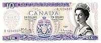
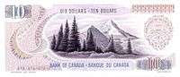
$10 note
The portrait on the obverse is of John A. Macdonald,[4] for which the engraving was created by Gunderson.[16]
A scene depicting the operations of Polymer Corporation in Sarnia, Ontario is on the reverse, chosen because the Crown corporation had "achieved a world-wide reputation" and the image "provided detail ideally suited to engraving", according to a Bank of Canada memorandum.[16] The engraving was made by De La Rue based on a photograph taken by Hunter.[16] In a Toronto Star article in 1990, Christopher Hume stated that the image of the petrochemical plant on the reverse was the most notable example of the dismal scenes of the series.[17]
The $10 banknote was first circulated in November 1971, and was printed by CBN.[16]
$20 note
The portrait on the obverse is of Elizabeth II.[4] The reverse depicts a scene of the Canadian Rockies,[4] specifically Moraine Lake in the Valley of the Ten Peaks, based on a photograph from the Canadian Pacific Railway archives.[12] The original engraving for the reverse was prepared by De La Rue, but because the mountains "did not seem authentic", an engraving prepared by BABN was used instead.[12]
It was unveiled at a press conference by the Bank of Canada on 18 June 1970, and released into circulation four days later.[4] It was printed by CBN and BABN.[12] An updated version was issued in December 1978 (dated 1979), for which the serial numbers were moved to the bottom centre of the reverse, the central obverse design was modified, and the secondary colours were more strongly emphasized to further differentiate the $20 banknote from the $1 banknote.[12]
$50 note
The portrait on the obverse is of William Lyon Mackenzie King,[4] based on a photograph by Karsh and engraved by Gunderson.[18]
The reverse depicts a dome formation from the Musical Ride of the Royal Canadian Mounted Police (RCMP). The vignette was suggested by Sterling Suggett, a researcher and banknote designer employed by the Bank of Canada, to honour the RCMP's centennial in 1973[5] and was based on a photograph taken by Donald K. Guerrette.[19] The image made this banknote the most popular of the series.[5] Originally, the vignette was to depict a frozen lake based on a photograph taken near Sudbury, Ontario, but it was rejected because the orange ink had a limited tonal range.[19] A photograph from a National Ballet of Canada performance of Swan Lake that had been proposed for the $1,000 banknote was chosen instead as the well-proportioned scene provided "an opportunity for truly virtuoso engraving".[19] A proof engraving was prepared by George Gunderson using slate gray as the dominant colour, but disappointed with the result suggested using "a shade between orchid and claret".[19] This led to the change to the Musical Ride image.[19]
The banknote's colouration was to be the same as that of the $50 banknote of the 1954 Series, but because the Bank of Canada discontinued using the heavy metal required to make the "traditional brilliant orange tint" ink, the colour was thus changed to red.[5]
The banknote was first circulated in March 1975 and printed by CBN.[18]
$100 note
The portrait on the obverse is of Robert Borden,[4] for which the engraving was prepared by Yorke.[11] The vignette on the reverse is of the harbour at Lunenburg in Nova Scotia, based on a photograph taken by G. Hedley Doty of the Nova Scotia Information Service and engraved by Yorke.[18]
It was printed by BABN, and first circulated in May 1976.[18]
Production
The banknote printers had to buy new equipment to be able to print the banknotes for this series.[10] Originally, the obverse was printed with one intaglio plate and three lithographic plates and the reverse was printed with one intaglio plate and two lithographic plates, except for the $50 banknote, for which an intaglio plate was not used.[10][18] In 1984, the Bank of Canada changed the printing process used for printing the reverse of each banknote, using only lithography instead of the steel engraving and lithography that had been previously used, and continued to be used for the obverse[20] This resulted in a smoother reverse and "slightly sharper" obverse.[20]
In 1977, the design of the banknotes was modified and the printing process updated to enable automated processing of the banknotes using machines.[10]
Printing
Each printing of the banknote series is signed by the Governor of the Bank of Canada and the deputy governor.
| Governor | Deputy Governor | Printing years | Denominations |
|---|---|---|---|
| Louis Rasminsky | John Robert Beattie | 1969–1971 | $10, $20 (1970) |
| Louis Rasminsky | Gerald Bouey | 1972–1973 | $5 (1972), $10, $20 (1970) |
| Gerald Bouey | R. William Lawson | 1973–1984 | $1, $2, $5 (1972, 1979), $10, $20 (1970, 1979), $50, $100 |
| Gerald Bouey | John Crow | 1984–1987 | $1, $2, $5 (1979), $10, $20 (1979), $50, $100 |
| John Crow | Gordon Thiessen | 1987–1993 | $10, $20 (1979), $50, $100 |
Counterfeiting
Offset printing could not accurately reproduce the range of tints complementing the dominant colour of the banknotes, resulting in a dramatic reduction of counterfeits in circulation.[21] The counterfeit ratio remained very low from 1977 to 1990.[22]
In October 1984, counterfeit $20 banknotes deemed to be of "good quality" were found circulating in Niagara Falls, leading to the confiscation of counterfeit banknotes with a face value of $2.2 million.[23]
In 2007, counterfeit $100 banknotes were found circulating in Regina and Moose Jaw, Saskatchewan. These lacked the fine line details present in the genuine banknotes, and had a different texture.[7] In 2012, counterfeit $50 banknotes were found circulating in parts of Nova Scotia.[24]
Collecting
By 1989, the Bank of Canada had sold over 50,000 uncut sheets of the $1 banknote, each containing 40 notes with sequential serial numbers.[25]
Legacy
When first issued into circulation, there were about 370 million banknotes in circulation from the 1954 Series, 1937 Series, and 1935 Series, having a total face value of about $3.4 billion.[3] With the release of the first banknote in June 1970, newspaper articles began referring to the banknote series as "multicolored money" and the "rainbow series", and stating that multicoloured banknotes were returning to Canada since the Bank of Canada had assumed the role as the country's only banknote supplier in 1935.[4] Some retailers did not believe that the $20, the first banknote of the series issued into circulation, was real currency.[1]
Because of wearing from use, the average banknote had a life expectancy of between nine and twelve months before being withdrawn from circulation.[26] In June 1987, the Bank of Canada announced that the $1 banknote would be replaced by the loonie, a $1 coin with a longer lifespan that would reduce production costs for the central bank by about $175 million over 20 years.[27] It expected to cease distribution of the $1 banknote by January 1989,[27] but ultimately delayed the final distribution until 30 June 1989.[26] About 19 million banknote stack wrappers were printed with the words "Be ready for the change! Order and use the new coin now!" in preparation for the change.[28] The Bank of Canada stated that withdrawing most of the 300 million $1 banknotes from circulation would take about three months.[25] The Royal Canadian Mint also increased the number of loonies released into circulation from 1 million in January 1989 to 9.8 million during one week in June.[26] Acceptance of the loonie was initially poor, so banks and retailers continued to conduct transactions using the banknotes.[29] By March 1989, support for the change to the $1 coin was 39% amongst Canadians surveyed by the Royal Canadian Mint, and 36% were opposed to the change.[28]
Withdrawal of the $1 banknote resulted in operational cost reductions for some businesses and organizations, such as the Toronto Transit Commission which previously invested over US$500,000 paying individuals to unfold banknotes collected in fare boxes.[25]
The city of Hull in Quebec purchased the tugboat depicted on the $1 banknote, named Missinaibi, which is now housed behind the Canadian Museum of History beside the Ottawa River.[13]
Notes
- 1 2 3 4 5 6 The Art and Design of Canadian Bank Notes 2006, p. 67.
- 1 2 3 Curator's Pick.
- 1 2 Ladysmith-Chemainus Chronicle 1970.
- 1 2 3 4 5 6 7 8 9 10 11 12 Montreal Gazette 1970.
- 1 2 3 4 The Art and Design of Canadian Bank Notes 2006, p. 68.
- 1 2 3 4 The Art and Design of Canadian Bank Notes 2006, p. 69.
- 1 2 CBC News 2007.
- ↑ The Art and Design of Canadian Bank Notes 2006, p. 72.
- ↑ Cross 1997, p. 237.
- 1 2 3 4 5 The Art and Design of Canadian Bank Notes 2006, p. 70.
- 1 2 The Art and Design of Canadian Bank Notes 2006, p. 71.
- 1 2 3 4 5 The Art and Design of Canadian Bank Notes 2006, p. 78.
- 1 2 3 4 5 6 7 The Art and Design of Canadian Bank Notes 2006, p. 75.
- ↑ CBC News 2014.
- 1 2 3 4 The Art and Design of Canadian Bank Notes 2006, p. 76.
- 1 2 3 4 The Art and Design of Canadian Bank Notes 2006, p. 77.
- ↑ Hume 1990, p. G11.
- 1 2 3 4 5 The Art and Design of Canadian Bank Notes 2006, p. 79.
- 1 2 3 4 5 The Art and Design of Canadian Bank Notes 2006, p. 73.
- 1 2 Ottawa Citizen 1984.
- ↑ Moxley, Meubus & Brown 2007, p. 48.
- ↑ Moxley, Meubus & Brown 2007, p. 49, Chart 1: Counterfeit Canadian Bank Notes Passed for Every One Million Genuine Notes in Circulation (PPM).
- ↑ Oakes 1986.
- ↑ CBC News 2012.
- 1 2 3 Reynolds 1989, p. 5.
- 1 2 3 Schenectady Gazette 1989.
- 1 2 Milwaukee Journal 1987.
- 1 2 Brent 1989, p. 1.
- ↑ Milwaukee Sentinel 1988.
References
- Brent, Bob (1 April 1989). "Changing the small change: it's the loons over the notes". Toronto Star. Retrieved 7 October 2014.
- Cross, W. K., ed. (1997). The Charlton Standard Catalogue of Canadian Government Paper Money (10th ed.). Toronto: The Charlton Press. ISBN 0-88968-190-2.
- Hume, Christopher (13 January 1990). "The new $50 bill goes ultra-modern". Toronto Star. Retrieved 7 October 2014.
- Moxley, Jill; Meubus, Helen; Brown, Maura (Autumn 2007). "The Canadian Journey: An Odyssey into the Complex World of Bank Note Production" (PDF). Bank of Canada Review. Bank of Canada.
- Oakes, Gary (26 September 1986). "Man, 36, jailed 2 years after bogus bills seized". Toronto Star. p. F19. Retrieved 21 September 2014.
- Reynolds, Richard (1 July 1989). "'Loonie' coin in Canada: Is it for the birds?". Toledo Blade.
- "Scenes of Canada". Bank of Canada. Retrieved 3 March 2014.
- The Art and Design of Canadian Bank Notes (PDF). Bank of Canada. 6 December 2006. ISBN 0660632462. Retrieved 27 September 2014.
- "Curator's Pick – Bank of Canada, 10 and 20 dollar models by Giori". Bank of Canada. Archived from the original on 5 August 2014.
- "Sask. RCMP caution against counterfeit vintage cash". CBC News. 6 April 2007. Retrieved 20 September 2014.
- "Fake $50s circulated around N.S.". CBC News. 22 May 2012. Retrieved 20 September 2014.
- "Inuit scene on $2 bill has a dark, storied history". CBC News. 6 May 2014. Retrieved 20 September 2014.
- "1969 – 1979 Series, Scenes of Canada". Currency Museum, Bank of Canada. Retrieved 3 March 2014.
- "New series of bank notes being printed in Canada". Ladysmith-Chemainus Chronicle. 62 (45). 8 July 1970. p. 10.
- "Canada is shifting to a dollar coin". Milwaukee Journal. Associated Press. 30 June 1987. p. 7A.
- "'Loonie' replaces paper dollar". Milwaukee Sentinel. Associated Press. 5 July 1988. p. 2 (part 4).
- "Multicolored banknotes back". Montreal Gazette. Canadian Press. 19 June 1970. p. 5.
- "Banknotes change". Ottawa Citizen. 27 March 1984. p. 39.
- "Canada issues no dollar bills, only 'loonies'". Schenectady Gazette. Associated Press. 1 July 1989.
External links
- 1969-1979 Series, Scenes of Canada at the Collections Canada archive of the Bank of Canada website
| Canadian coinage | |
|---|---|
| Commemorative coins |
|
| Canadian banknotes | |
| Canadian banknotes by Series | |
| Historical currencies of Canada | |
| Newfoundland dollar | |
| Organizations and institutions | |
| Community currencies |
|
| Other | |