New York City Subway tiles

Many New York City Subway stations are decorated with colorful ceramic plaques and tile mosaics. Of these, many take the form of signs, identifying the station's location. Much of this ceramic work was in place when the subway system originally opened on October 27, 1904. Newer work continues to be installed each year, much of it cheerful and fanciful.[1][2]
Original IRT and BMT tiles
Heins & LaFarge (1901–1907)

The earliest ceramic work was done by Heins & LaFarge (artists George C. Heins and Christopher Grant LaFarge), starting in 1901 and continuing up to 1907. Heins and LaFarge were both relatives of John LaFarge (brother-in-law and son, respectively), a leading stained-glass artisan of the day. They were part of the Arts and Crafts movement and worked in the Beaux-Arts architecture style, both of which were very much in vogue at the turn of the 20th century. At the time of their hiring they had completed large projects at New York's Cathedral of St. John the Divine and Bronx Zoo. In addition to designing the artistic motifs, Heins and LaFarge also did much of the architectural work that determined the overall appearance of entire subway stations.
They designed name tablets that were made up of tiles with the station name in serif and sans serif roman lettering, with all of the letters capitalized. Some of the tiles by Heins and LaFarge are for station directional information such as directions to exits, platforms of different lines and systems, and platforms of different directions. The name tablets in each station contained elaborate border tilework surrounding the tablet.[3]
Heins and LaFarge knew what materials would stand up well to heavy-duty cleaning and scrubbing; they worked with the ceramic-producing firms Grueby Faience Company of Boston and Rookwood Pottery of Cincinnati.
Their ceramic artwork includes colorful pictorial motifs relevant to a station's location, for example:
- The South Ferry loop station is decorated by 15 bas-relief representations of a sailing ship on the water.
- The Astor Place station is decorated with large ceramic beaver emblems, representing the beaver pelts that helped make John Jacob Astor wealthy.
- The 116th Street – Columbia University station includes a bas-relief emblem representing nearby Columbia University.
Their bas-reliefs in the subway have been likened to the work of the Italian Renaissance artist Andrea Della Robbia. Much of their tile work was station-identifying signs to guide passengers. Besides serving an aesthetic function, the images are helpful to New York City's large population of non-English speakers and those who can't read. A traveler can be told to "get off at the stop with the picture of a beaver." As well as pictorial plaques and ceramic signs, Heins and LaFarge designed the running decorative motifs, such as egg-and-dart patterns, along station ceilings.[3]
In addition to their wall-side tilework, Heins and LaFarge “hung large, illuminated porcelain-enamel signs over the express platforms, using black type [actually hand-lettering] on a white background and painted station names on the round cast-iron columns.”[3]
Squire Vickers (1906–1942)
In 1906, Squire J. Vickers, then a young architect, was hired. Vickers showed much respect for Heins and LaFarge, but his work consists much more of mosaics; he did not use bas-relief, citing the need for easy cleaning. Vickers also preserved the fonts that Heins and LaFarge used in their name tablets; however, in Vickers's new name tablets, the tilework on the borders of the tablets was more simplified.[3]
In his pictorial work, Vickers emphasizes actual buildings as landmarks, such as his colorful depiction of Brooklyn Borough Hall (1919) at the station of that name, rather than Heins and LaFarge's beavers and sailing ships. He describes his technique:
| “ | "...the mosaic was of the cut variety, that is, the body is burned in strips, glazed, and then broken into irregular shapes. The designs are set by hand and shipped in sections with paper pasted on the front. These sections are set against the wall flush with the tile. In certain stations the color bands and name tablets are a combination of mosaic and hand-made tile" | ” | |
| — (Stookey, 1994). | |||
.jpg)
Through the 1930s, Vickers ordered some enamel signs for the IRT and BMT from both Nelke Signs and the Baltimore Enamel Company. These signs were located on girder and cast-iron columns, and made them easier to identify stations. Shortened station names on the porcelain-enamel signs had a condensed sans serif capital-letter font.[3]
Vickers continued to work on subway projects for 36 years, until 1942.
2007 exhibition

Two exhibitions, one celebrating the work of Heins & LaFarge and one for Vickers, were mounted at the New York Transit Museum's Gallery Annex[4] at Grand Central Terminal during 2007.
IND tiles
The tiles used in the Independent Subway System (IND) are very simple and austere, and usually are only of four colors: white, black, and the station-specific band and border colors of the tile. Instead of using the serif and sans-serif fonts of the IRT and BMT, the IND used a blocky geometric font, an altered version of the previous sans-serif font. The Art Deco-influenced form of the IND's tiles was designed in part by Vickers, who integrated directional signs mainly into the walls themselves.[3]
The station-specific tiles used in the IND's stations are all grouped in a specific pattern. With one exception, these groupings follow the same order: (going outbound): Purple, Blue, Green, Yellow, and Red. The exception is on the IND Fulton Street Line: Utica Avenue/Ralph Avenue/Rockaway Avenue (red family) is followed by blue family stations, Broadway Junction, Liberty Avenue, Van Siclen Avenue, and Shepherd Avenue, then purple (Euclid Avenue), then green (Grant Avenue). As one goes away from Manhattan, the color of the tiles changes; thus, a local station that comes directly west of an express station has the same color tiles as the next express station away from Manhattan. This is presumably to facilitate transfers for travelers going away from Manhattan. Express stations have wider tile bands than local stations, except on certain stations on the lower portion of the IND Eighth Avenue Line, where the station walls have been refurbished. Tablets are simple, with a common design, and black tile with white letters spell out the station name on the wall.[5][6]
Most pre-1955 IND stations have tile plaques with the station name, as well as a colored stripe with black borders, on the platforms or track walls. Tile plaques only exist in stations where there is a wall next to the platform. The number of tiles between the stripes are 2 tiles for local stations and three for express/transfer stations. Several original stations that were renovated, such as Lexington Avenue / 53rd Street, have no color.
The IND Crosstown Line, having no express stations, uses three forms of green in its tile bands, with light green indicating transfer stations. (Broadway was planned as a transfer to an IND Second System line; thus, the walls at Broadway have three rows of tiles, rather than the two rows of tiles found on other Crosstown Line stations' walls).


| List of IND tile colors by station (underground stations only) | ||||
|---|---|---|---|---|
| Station | Band Color | Border Color | Tile Height | Notes |
| Red Family | ||||
| 169th Street | Carmine Red | Black | 2 | |
| Parsons Boulevard | Scarlet Red | Black | 3 | |
| Court Square – 23rd Street | Scarlet Lake | Dark Brown | 2 | [note 1] |
| 5th Avenue – 53rd Street | Carmine Red | Crimson | 2 | [note 2] |
| 47th–50th Streets | Scarlet Red | Dark Brown | 3 | |
| 42nd Street–6th Avenue | Scarlet Red | Dark Brown | 3 | |
| 34th Street–Penn Station | Burgundy | Black | 2 | |
| 168th Street | Burgundy | Black | 2 | |
| 207th Street | Claret Red | Pearl Grey | 2 | [note 3] |
| Tremont Avenue | Claret Red | Black | 3 | |
| 182nd–183rd Streets | Claret Red | Black | 2 | |
| Utica Avenue | Tuscan Red | Maroon | 3 | |
| Ralph Avenue | Tuscan Red | Maroon | 2 | |
| Rockaway Avenue | Tuscan Red | Maroon | 2 | |
| Church Avenue | Burgundy | Maroon | 2 | |
| Fulton Street | Tuscan Red | Maroon | 2 | [note 4][note 5] |
| Yellow Family | ||||
| Sutphin Boulevard | Sunshine Yellow | Black | 2 | |
| Briarwood | Corn Yellow | Black | 2 | |
| Union Turnpike | Jasmine | Black | 3 | |
| 14th Street–8th Avenue | Mustard Yellow | Terra Cotta Brown | 2 | |
| 145th Street | Deep Yellow | Black | 2 | |
| 34th Street | Deep Yellow | Yellow Ochre | 3 | [note 6] |
| 155th Street | Deep Yellow | Black | 2 | |
| 161st Street – Yankee Stadium | Mustard Yellow | Black | 2 | [note 7] |
| 167th Street | Spanish Orange | Black | 2 | |
| 170th Street | Spanish Orange | Black | 2 | |
| 174th–175th Streets | Deep Yellow | Black | 2 | |
| Seventh Avenue | Orange Yellow | Brown | 3 | [note 8] |
| 15th Street – Prospect Park | Orange Yellow | Brown | 3 | |
| Fort Hamilton Parkway | Orange Yellow | Brown | 2 | |
| Nostrand Avenue | Maize | Saddle Brown | 3 | |
| Kingston–Throop Avenues | Maize | Saddle Brown | 2 | |
| Broad Street | Deep Yellow | Saddle Brown | 3 | [note 4][note 5] |
| Green Family | ||||
| 75th Avenue | Light Green | Black | 2 | |
| Forest Hills – 71st Avenue | Nile Green | Black | 3 | |
| 23rd Street | Medium Light Green | True Green | 2 | |
| 14th Street | Medium Light Green | True Green | 2 | |
| West 4th Street | Grass Green | Chrome Green | 2 | |
| 125th Street | Marine Green | Black | 2 | |
| Bedford Park Boulevard | Grass Green | Chrome Green | 3 | |
| 205th Street | Medium Light Green | Campus Green | 2 | |
| Court Square | Hunter Green | Black | 2 | |
| 21st Street | Hunter Green | Black | 2 | |
| Greenpoint Avenue | Hunter Green | Black | 2 | |
| Nassau Avenue | Hunter Green | Black | 2 | |
| Metropolitan Avenue | Nile Green | Black | 2 | |
| Broadway | Nile Green | Black | 2 | |
| Flushing Avenue | Light Green | True Green | 2 | |
| Myrtle–Willoughby Avenues | Light Green | True Green | 2 | |
| Bedford–Nostrand Avenues | Light Green | True Green | 2 | |
| Classon Avenue | Light Green | True Green | 2 | |
| Clinton–Washington Avenues | Light Green | True Green | 2 | |
| Fulton Street | Light Green | True Green | 2 | |
| Hoyt–Schermerhorn Streets | Light Green | True Green | 2 | [note 9] |
| Lafayette Avenue | Light Green | True Green | 2 | |
| Clinton–Washington Avenues | Light Green | True Green | 2 | |
| Franklin Avenue | Light Green | True Green | 2 | |
| Grant Avenue | Bottle Green | Ice Green | [note 10] | |
| Bergen Street | Bottle Green | Light Green | 2 | [note 11] |
| Carroll Street | Lawn Green | Hunter Green | 2 | |
| Blue Family | ||||
| 67th Avenue | Sky Blue | Black | 2 | |
| 63rd Drive | Sky Blue | Black | 2 | |
| Woodhaven Boulevard | Cerulean Blue | Black | 2 | |
| Grand Avenue | True Blue | Black | 2 | |
| Elmhurst Avenue | True Blue | Black | 2 | |
| Roosevelt Avenue – 74th Street | Violet Blue | Black | 2 | |
| 59th Street | Ultramarine Blue | Black | 2 | |
| 81st Street | Midnight Blue | Black | 1 | [note 12] |
| Kingsbridge Road | Ultramarine Blue | Cobalt Blue | 3 | |
| Spring Street | Ultramarine Blue | Cobalt Blue | 2 | [note 13] |
| Canal Street | Royal Blue | Black | 3 | [note 14] |
| Jay Street | Ultramarine Blue | Cobalt Blue | 2 | |
| Broadway – Lafayette Street | Royal Blue | Black | 3 | [note 15] |
| York Street | Cloud Blue | Periwinkle Blue | 1 | [note 16] |
| Broadway Junction | Blueberry | Delft Blue | 3 | |
| Liberty Avenue | Cornflower Blue | Ultramarine Blue | 2 | |
| Van Siclen Avenue | Cornflower Blue | Ultramarine Blue | 2 | |
| Shepherd Avenue | Cornflower Blue | Ultramarine Blue | 2 | |
| Court Street | Aquamarine Blue | Royal Blue | 2 | |
| Eighth Avenue | Ultramarine Blue | Cobalt Blue | 2 | [note 4] |
| Purple Family | ||||
| 179th Street | Violet | Black | [note 10][note 17] | |
| 65th Street | Mauve | Black | 2 | |
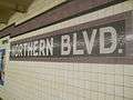
| Northern Boulevard | Mauve | Black | 2 | |
| 46th Street | Grape | Black | 2 | |
| Steinway Street | Grape | Black | 2 | |
| 36th Street | Grape | Black | 2 | |
| Queens Plaza | Black Grape | Black | 3 | |
| Seventh Avenue | Royal Purple | Black | [note 18][note 19] | |
| 42nd Street | Orchid | Black | 2 | [note 20] |
| Chambers Street | Blue Violet | Black | [note 21] | |
| World Trade Center | Concord Grape | Black | 3 | [note 22] |
| Fulton Street | Violet | Grape | 2 | |
| High Street | Violet | Grape | 2 | |
| Euclid Avenue | Lilac | Medium Violet | 3 | |
| Second Avenue | Medium Violet | Violet | 3 | |
| Delancey Street | Lavender Blue | Grape | 2 | |
| East Broadway | Lavender Blue | Black | 3 | |
| Fordham Road | Grape | Plum | 3 | |
| No color | ||||
| 175th Street | ||||
| Lexington Avenue–53rd Street | ||||
| Color only on station plaque | ||||
| Dyckman Street | Burgundy | |||
| 190th Street – Overlook Terrace | Burgundy | |||
| 181st Street | Burgundy | |||
| 163rd Street – Amsterdam Avenue | Orange Yellow | |||
| 155th Street | Orange Yellow | |||
| 135th Street | Marine Green | |||
| 116th Street | Midnight Blue | |||
| 110th Street | Midnight Blue | |||
| 96th Street | Midnight Blue | |||
| 86th Street | Midnight Blue | |||
| 72nd Street | Midnight Blue | |||
| 50th Street | Orchid | |||
| 23rd Street | Deep Yellow | |||
| Stations not in the original IND with tiles | ||||
| 57th Street | White | |||
| Lexington Avenue – 63rd Street | Orange[note 23] | |||
| Roosevelt Island | White | |||
| 21st Street – Queensbridge | Brick red | |||
| Jamaica – Van Wyck | Orange | |||
| Sutphin Boulevard – Archer Avenue – JFK Airport | Grey | |||
| Jamaica Center – Parsons/Archer | Tan | |||
| ||||
Newer tiles
Glazed tiles (1950s–1970s)
By the 1950s, trains were increased in length from 5 cars to 8–10 cars. Glazed tiles in colors such as dull green, ochre, and blue adorned the new station extensions' walls. Letters were screened onto the tiles in black sans serif font.[3]
Porcelain tiles (late 2000s–present)
.jpg)
New stations on the Second Avenue Subway will have porcelain tiles and built-in artwork.[7]
The walls adjacent to the tracks at the new 34th Street station have white tiles arranged in sets of three columns of 3 tiles each. There are two-tile-high gray squares containing white "34"s in the middle of each set of columns.[8]
The South Ferry station has white porcelain tiles separated by rows of metal.
Renovated and new tiles in existing stations
Several subway stations have new ceramics and mosaics:
- The 28th Street station on the BMT Broadway Line features the fanciful "City Dwellers" mosaic by Mark Hadjipateras.[9]
- The Houston Street station on the IRT Broadway – Seventh Avenue Line displays "Platform Diving" by Deborah Brown.[10]
- The 81st Street – Museum of Natural History station on the IND Eighth Avenue Line has "For Want of a Nail" by the MTA Arts for Transit Design Team.[11]
- The Prince Street station on the BMT Broadway Line shows "Carrying On", an artwork by Janet Zweig.[12]
- The Cathedral Parkway – 110th Street station on the IND Eighth Avenue Line boasts "Migration" by artist Christopher Wynter.[13]
- The 191st Street station on the IRT Broadway – Seventh Avenue Line has been renovated with reproductions of its original tile work.
References
- ↑ Subway Art Guide
- ↑ "THE NEW MOSAICS - Forgotten New York". Retrieved 29 July 2016.
- 1 2 3 4 5 6 7 Paul A. Shaw (November 18, 2008). "The (Mostly) True Story of Helvetica and the New York City Subway". AIGA. aiga.org. Retrieved February 4, 2009.
- ↑ "MTA - Transit Museum General Information". Retrieved 29 July 2016.
- ↑ "www.nycsubway.org: History of the Independent Subway". Retrieved 29 July 2016.
- ↑ "www.nycsubway.org: IND Station Tile Colors". Retrieved 29 July 2016.
- ↑ Ben Yakas (2014-01-22). "Here's What The Second Avenue Subway Will Look Like When It's Filled With Art". Gothamist. Retrieved 2014-05-05.
- ↑ "7 Line Extension 060". Retrieved 29 July 2016.
- ↑ "www.nycsubway.org: Artwork: City Dwellers (Mark Hadjipateras)". Retrieved 29 July 2016.
- ↑ "www.nycsubway.org: Artwork: Platform Diving (Deborah Brown)". Retrieved 29 July 2016.
- ↑ "www.nycsubway.org: Artwork: For Want of a Nail (MTA Arts for Transit)". Retrieved 29 July 2016.
- ↑ "www.nycsubway.org: Artwork: Carrying On (Janet Zweig)". Retrieved 29 July 2016.
- ↑ "www.nycsubway.org: Artwork: Migrations (Christopher Wynter)". Retrieved 29 July 2016.
Further reading
- Sapulding, Lee (2010). Subway Mosaics: New York City, CreateSpace. ISBN 9781453730881
- Stookey, Lee (1994). Subway Ceramics. North Haven, CT: William J. Mack Co. ISBN 9780963548610
External links
| Look up subway tile in Wiktionary, the free dictionary. |
| Wikimedia Commons has media related to New York City Subway mosaics. |
- MTA Arts for Transit-The Official NYC Subway Art and Rail Art Guide
- New York - New Mosaics
- Subway Art Guide
- SubwayCeramics Historically-authentic subway tile
- The History of Subway Tile
| Services |
|      | ||||||
|---|---|---|---|---|---|---|---|---|
| Stations | ||||||||
| Divisions | ||||||||
| Other lists | ||||||||
| Expansion | ||||||||
| History | ||||||||
| Infrastructure | ||||||||
| Arts and culture | ||||||||
| Miscellaneous | ||||||||
| Other rapid transit in NYC | ||||||||